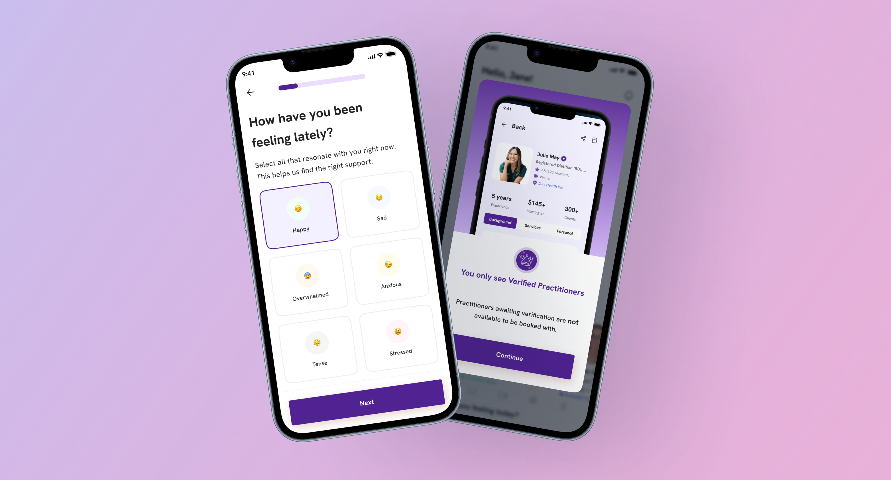
Reducing Cognitive Load in AI Wellness Onboarding
Overview
FemEntity is an AI-powered wellness platform that helps users find practitioners and resources based on their needs and preferences.
I joined after the initial onboarding concept had already been designed. I redesigned the existing flow and, as product priorities evolved, worked through several more iterations to make onboarding simpler and reduce the mental load of answering a long series of questions.
The main challenge was to collect enough information for relevant personalization without asking users to commit too much time upfront.
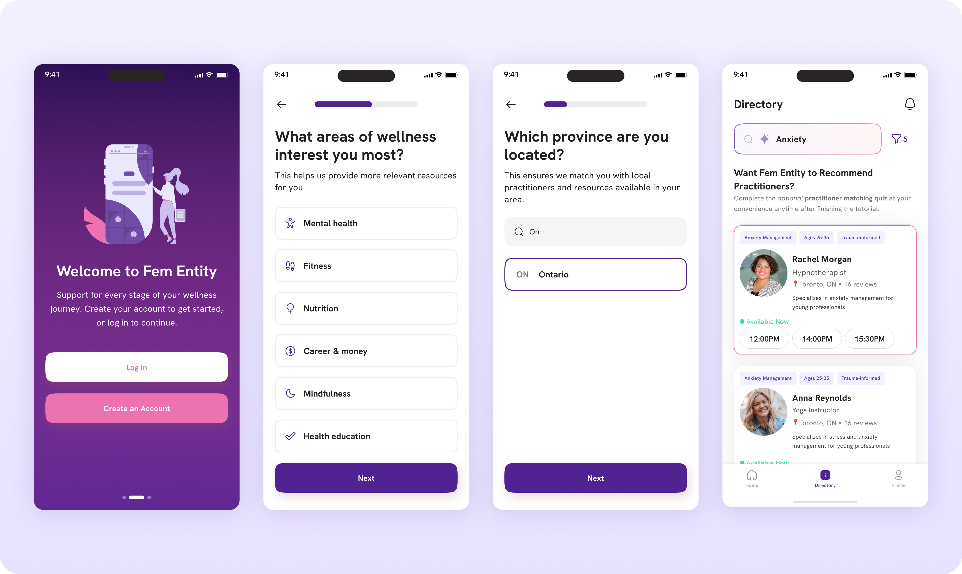
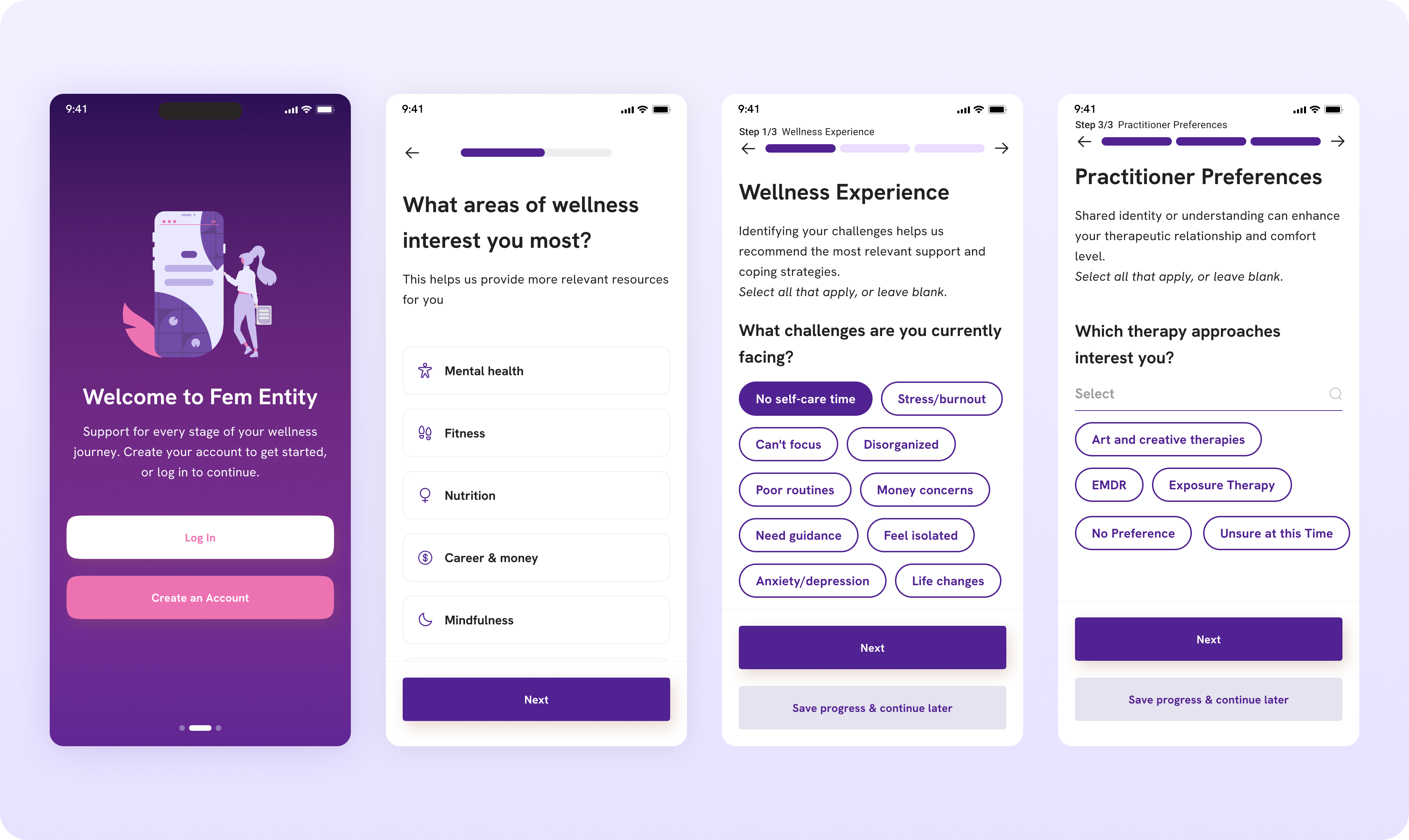
The redesigned onboarding: a shorter path from first impression to personalized wellness support, with key information collected progressively along the way.
Problem
The onboarding asked too much, too soon
Users had to answer a long series of questions before getting to the value of FemEntity. This created unnecessary mental load, especially when sharing sensitive personal information.
The value wasn't always clear
Users were more willing to share information when they understood how it would help personalize their experience.
We needed to simplify without losing useful data
The challenge was to decide what users needed to answer upfront and what could be collected later.
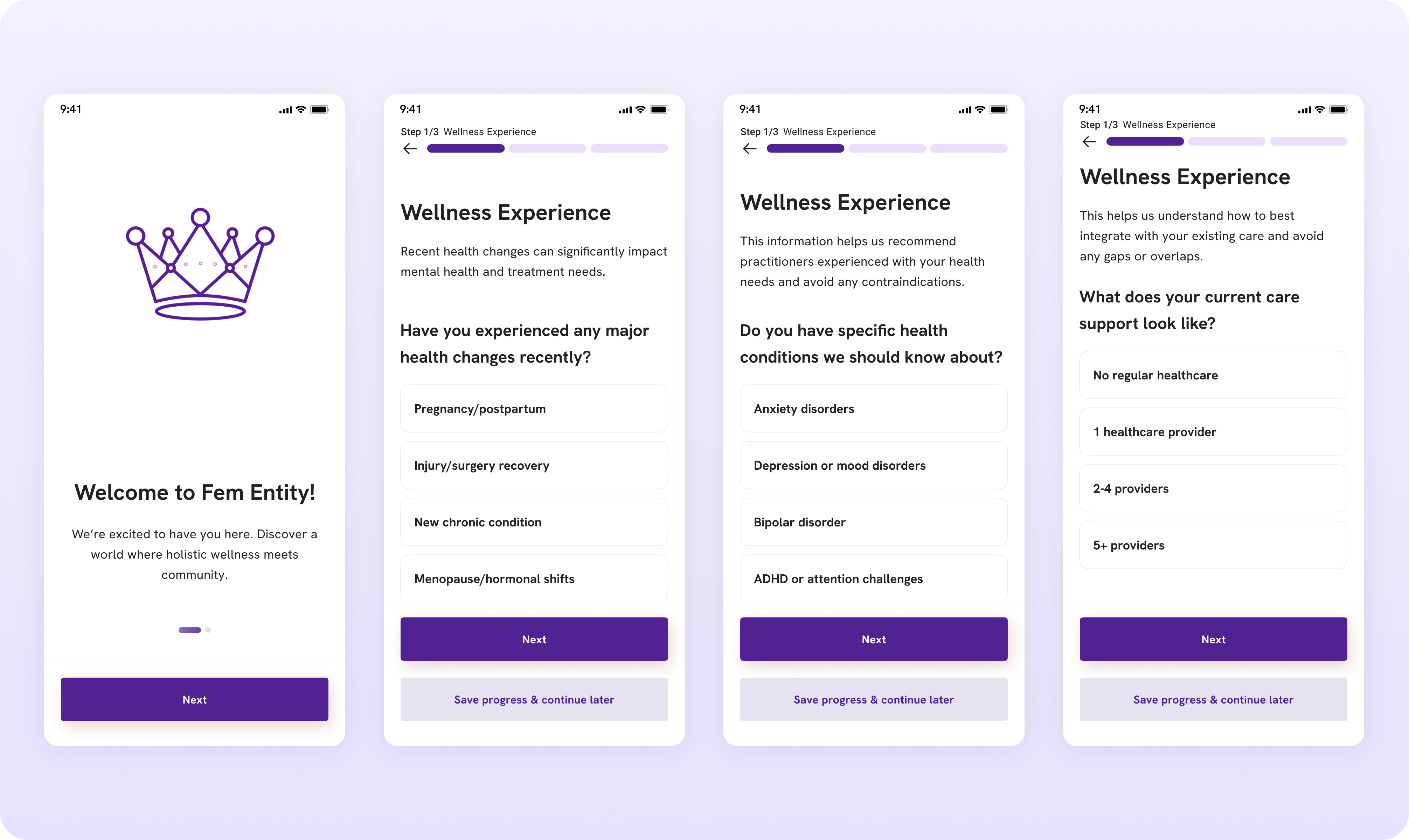
The previous onboarding. The flow asked for a lot of information upfront, with limited context around why it was needed.
Research
I ran a heuristic evaluation of the existing flow and a thematic analysis of user feedback from 20 interviews.
Three issues stood out:
- Too much information upfront — users were asked for a lot of personal information before seeing clear value.
- Unclear value — the flow did not always explain why information was needed or how it would improve their experience.
- High cognitive load — long forms and complex questions made the onboarding feel like a lot of work.
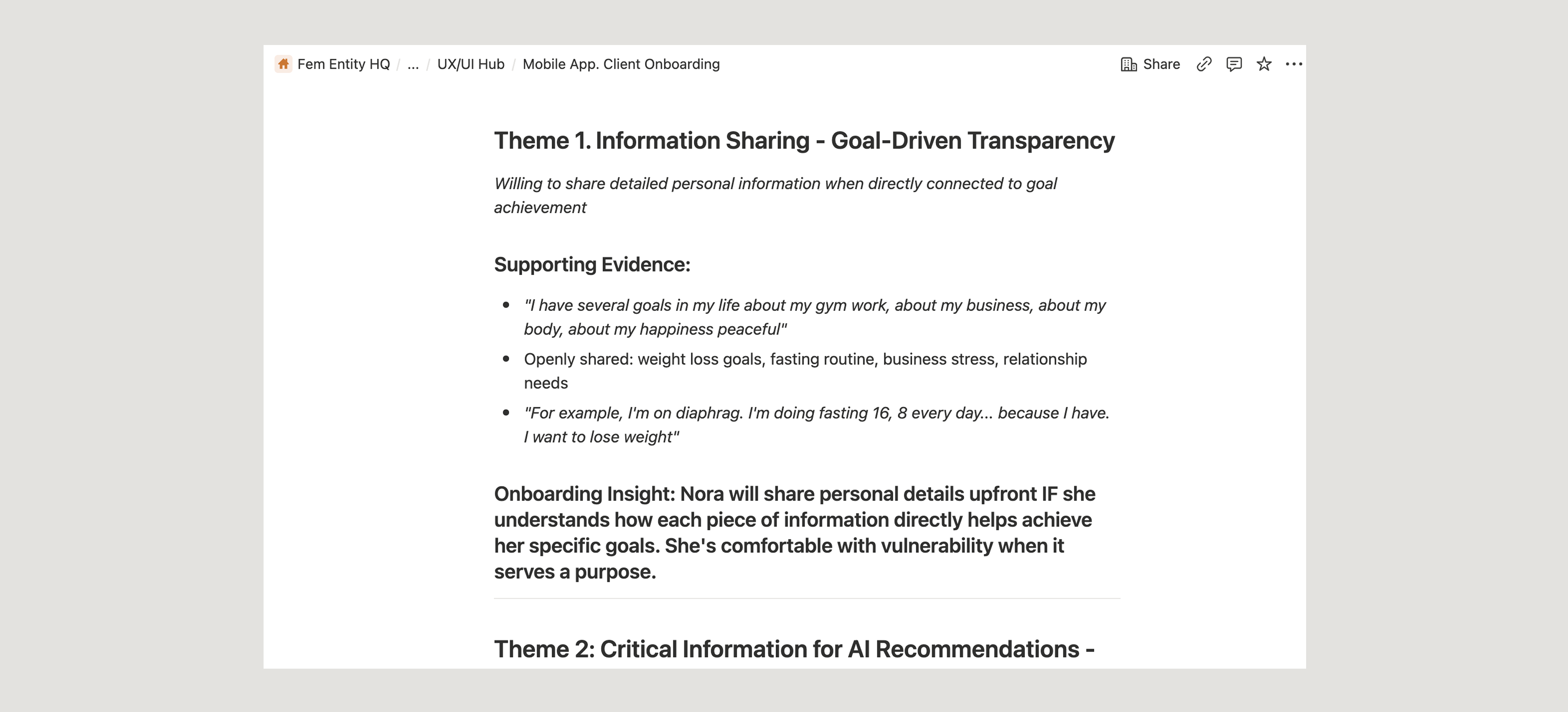
A recurring research insight was that users were willing to share personal information when they understood how it would help them get better recommendations.
Onboarding priorities
The onboarding had to collect enough information for personalization without asking users to do too much upfront. I reworked the flow around three priorities: show the value early, reduce the initial mental load, and explain why we need personal information.
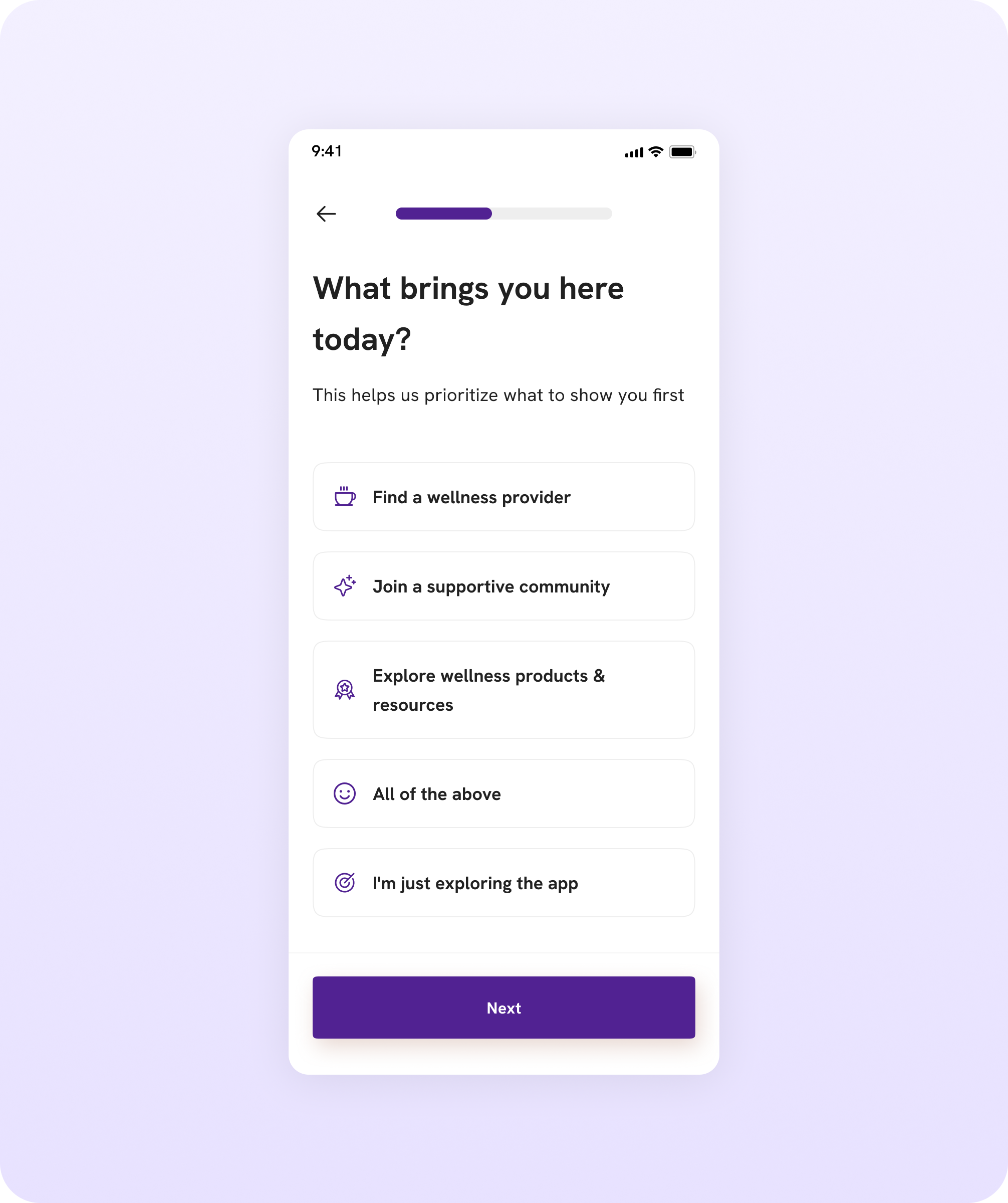
Rather than starting with demographic or personal details, we wanted to understand what the user was looking for first. This also helped connect the onboarding questions to the value FemEntity could provide.
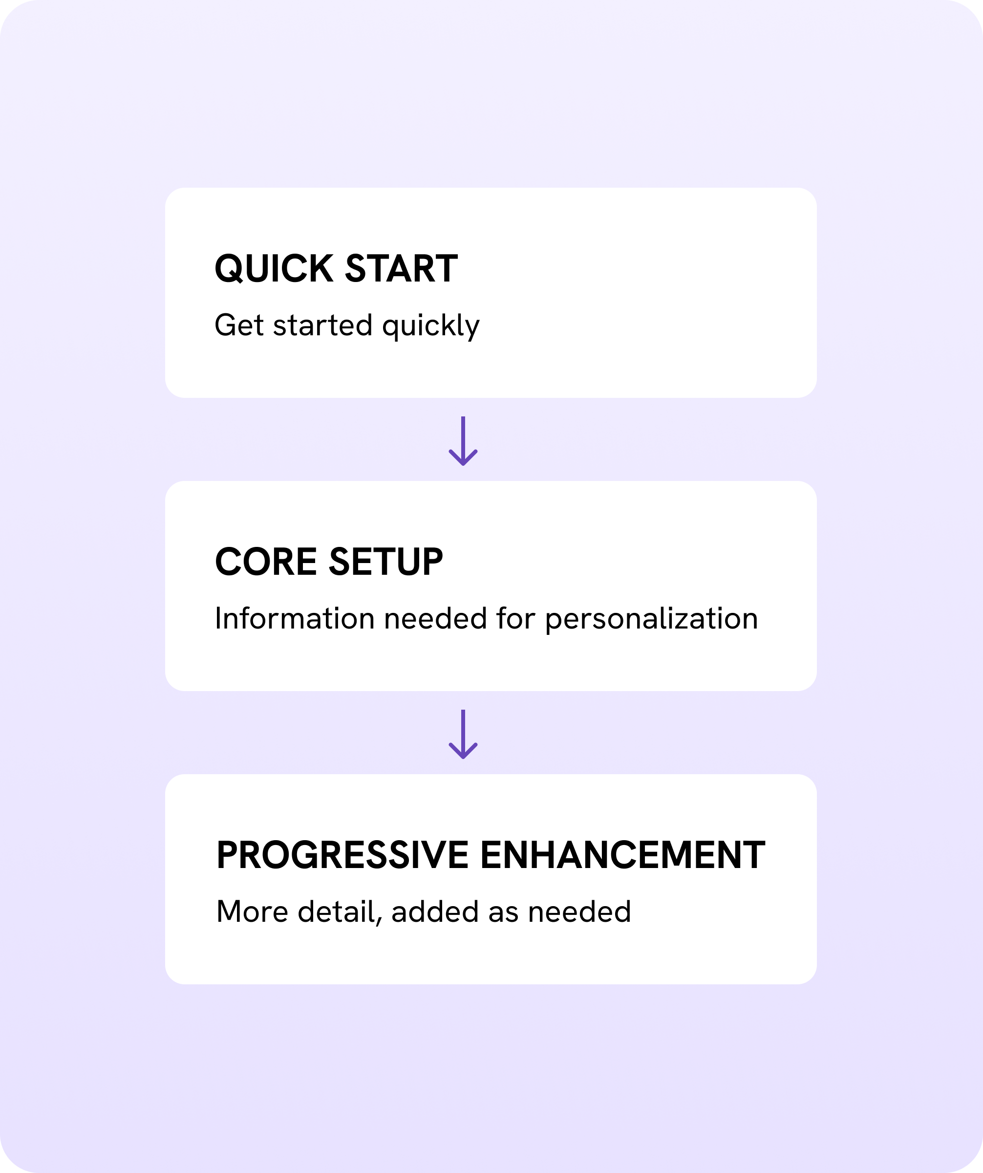
The original flow asked for too much information upfront, with complex forms and profile screens creating cognitive load. We restructured the onboarding around progressive disclosure. Essential information comes first, while more detailed profile information can be collected later.
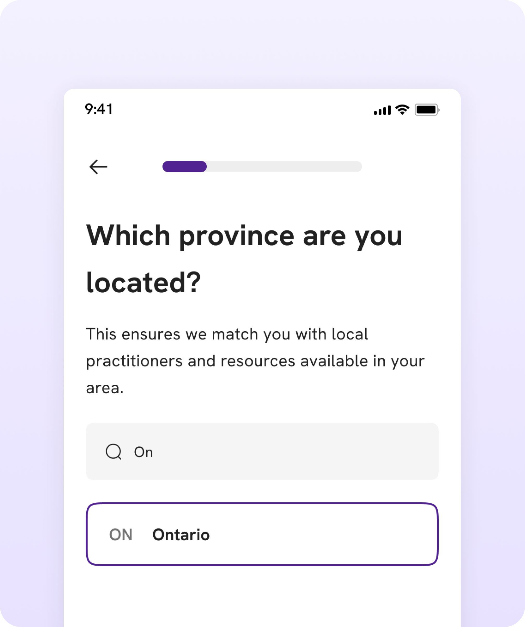
Users were more comfortable sharing personal information when they understood how it would improve their experience. We added context around questions such as location, interests, and challenges instead of asking for information without explaining its purpose.
The real win was lower cognitive load
Because FemEntity was still pre-launch, we couldn't measure onboarding completion in production. Instead, we used user feedback and testing to evaluate whether the redesigned flow felt easier to navigate.
The final onboarding evolved through multiple iterations, balancing three needs:
- User needs: simple, clear and manageable onboarding
- Product needs: enough information for relevant recommendations
- AI requirements: structured data such as location, specialty, availability and user preferences for matching.
The result is a more structured onboarding experience that collects information progressively instead of asking users to complete everything at once.
Impact
Pre-launch: quantitative conversion metrics were not yet available.
The redesigned flow established a simpler MVP onboarding structure and a foundation for measuring:
- onboarding completion rate
- drop-off at each step
- time to complete onboarding
- quality and relevance of initial recommendations
Key learning
In a wellness product, reducing friction is not only about reducing the number of screens. It is about helping users understand why you are asking and what they will get in return.